Picture books occupy a unique place in the world of sequential art. As Professor Sipe writes, in a picture book words and pictures combine to create something greater than the text or images alone. I think that it is also the simple and concise nature of those words and pictures that set picture books apart from other, longer forms of visual storytelling. The books length and its need to be understood by a young reader require the author and artist to be exceptionally clear and focused about what they are saying. The story can’t be diverted by tangential action or caught up in imagery for its own sake. One of the hardest parts of creating a picture book is deciding what to leave out. I am often heartbroken over omitting great images or sequences that, in the end, were not central to the story or did not move the story forward. I strive to reach the point where there is nothing I could take away from the story and there is nothing I need to add.
I agree with Professor Sipe and Chris Raschka when they talk about how the book itself, as opposed to any single element, is the art that is created. I use all my art skills to compose, draw and paint the illustrations, but they are only one part of a larger whole.
When I am writing and designing a book I am simultaneously working on the layout for the whole book as well as individual double page spreads. Each spread must convey a specific piece of the story. It must also move the reader to the turn of the page and set up their reaction to the next spread. Do I want to build suspense at the page turn? Do I want the reader to be surprised when they turn the page? Do I want them to laugh? The act of turning the page is one of the most important aspects of writing and illustrating a picture book.
It is critical for me to have an overarching design for these spreads to work within. I try to find a design that is visually elegant and has a relationship to the story. I’ll use my book Sector 7 as an example. The story takes place in two locations – on the ground and high in the sky at the Sector 7 Cloud Dispatch Center (This is where the clouds get, via blueprints, the assignments for the formations they make each day). There is the real world and there is a fantasy world.
The first and last thirds of the book take place on the ground, while the middle third takes place in the sky. I wanted each world to have its own look and feel. In the earthbound sections the images are contained within a rectangle surrounded by a three quarter inch white border. The rectangle can be a single image or divided into smaller panels. When the story moves into the sky the format changes to full-bleed double page spreads – that is, the pictures now extends all the way to the edge of the paper. These spreads sometimes have an inset rectangle that can be a single image or can be divided into smaller panels. (See example below)
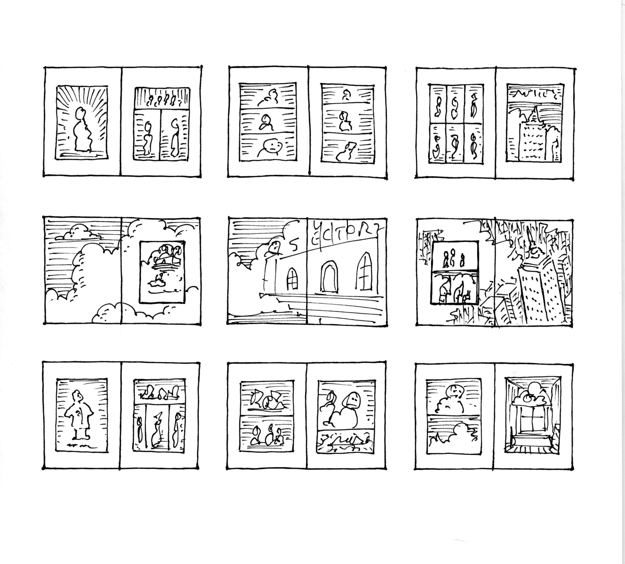
The framing of the earthbound sections put the story at a distance. The reader is an observer of the action. When the story moves into the fantasy world the frame is removed. As the pictures expand to the edge of the page and beyond the reader is drawn into that world and made a part of it.
The picture book allows this design to encompass not only the pages where the story takes place, but to include the cover, title page, endpapers, and even the binding. Apparently these things have a name, the peritext. Who knew? They can be used in many ways to set up the story and add visual material that conveys information or just fun commentary on the story. Continuing with Sector 7, I had an idea for the title page of that book that I was very excited about. The story is wordless – the only words are contained within signs in the art. My idea was to make this book have no set type at all. The only text that needed to be typeset was the title, my name and the copyright material. If I made the title page a picture of a blueprint – like the ones the clouds used – I could have all the text be part of the art: my name as architect, etc.
Sector 7 is forty-eight pages and there is a lot of complex imagery. My drawing for the title page was also very complex. There was a lot for the eye to absorb. It was too much in the context of the rest of the book. Instead, the title page became a simple neutral toned background with the title and my name typeset in a classic font. The simpler design was a restful place for the eye before it entered into the intricacies of the story. I loved the idea of the blueprint, but it didn’t serve the book.
Had I chosen to make Sector 7 longer – a graphic novel, say, – I could have used that blue print title page. I would have had the room to surround it with quieter pages. The longer length in a book allows for the expansion of narrative and picture elements. Interesting story tangents or mood building imagery can be explored. I find those possibilities incredibly exciting. I am thrilled by the ways visual books are pushing in new directions, some of which Professor Sipe has mentioned. But, for me, the longer books are not picture books. The term picture book refers to the 32 – 48 (or so) page book. It’s a form that puts a premium on simple, precise storytelling. It is an art unto itself.