To begin these posts I am going back to the moment I entered the world of children’s books.
Near the end of my senior year at the Rhode Island School of Design, Trina Schart Hyman came to school to talk about being a children’s book illustrator. She was great – casual, funny and straight talking. At the time she was also the art director for Cricket magazine and she stayed an extra day to look at portfolios. I showed her my work and she offered me a job creating a cover for Cricket. The rest, as they say, was history.
(The full account of this moment can be read in an article I wrote for the book, Celebrate Cricket: 30 Years of Stories and Art)
(Hyperlink to writings section and article – also link book to Indie Bound website?)
The part of that story I never tell is about creating the art. The deadline for delivery wasn’t until September, so I had the whole summer to work on it – and I used it. I graduated in June, moved back to my parent’s house in New Jersey (surprise!) and set up a studio in the basement.
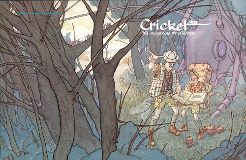
My parents saved everything I drew as a kid. By the fifth grade, I was saving everything myself. This archival mentality has continued to this day – I have all the preliminary materials for all of my work. Case in point – the March 1979 cover for Cricket.
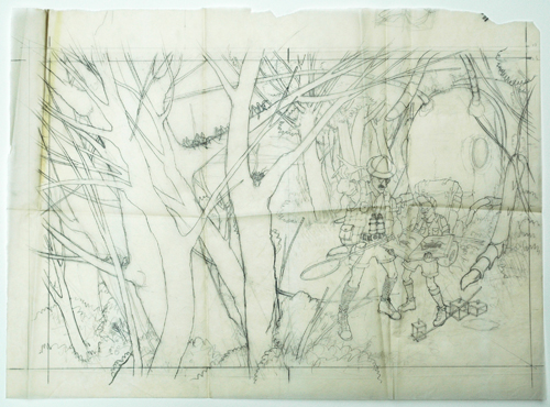
I always do my preliminary drawings on tracing paper. I apparently stored this drawing with little regard for its care, unlike most drawings I’ve done since then.
This issue of Cricket was the first at a larger trim size – 9” high by 7” wide. Still in my art school mindset (and thankfully with a long deadline) I decided to work up in size. Way up – 160%.
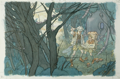
It was the strangest sensation to pack this painting up, go to my local post office, hand it over to the clerk and walk away empty handed. After my classes I always had the work with me. This job was done – now what?
After a couple months I received a printer’s proof.
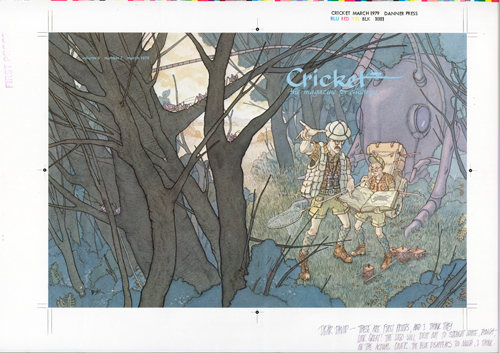
My painting! In print! I was (almost) published! At the time, that was obviously the most important part of this experience. Now, though, the thing I cherish about this is the inscription at the lower right.
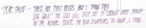
Anyone who ever corresponded with Trina knows the beauty of her unmistakable handwriting. She made you feel great about your work and made you want to always do your best. As she notes, the blue fades away to much and was changed to white in the final printing:
After this I thought – gee, full color covers for national magazines doing whatever imagery I want – how easy!
Hah.
But, that’s another post.
Ps. Part of the job was to also draw something for the title page of that issue. I drew this:
They received a couple letters complaining about the implied violence of this image – that the giant cricket had attacked the naturalist. That makes me smile.